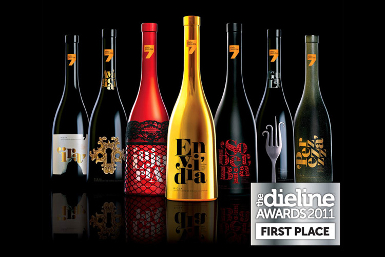
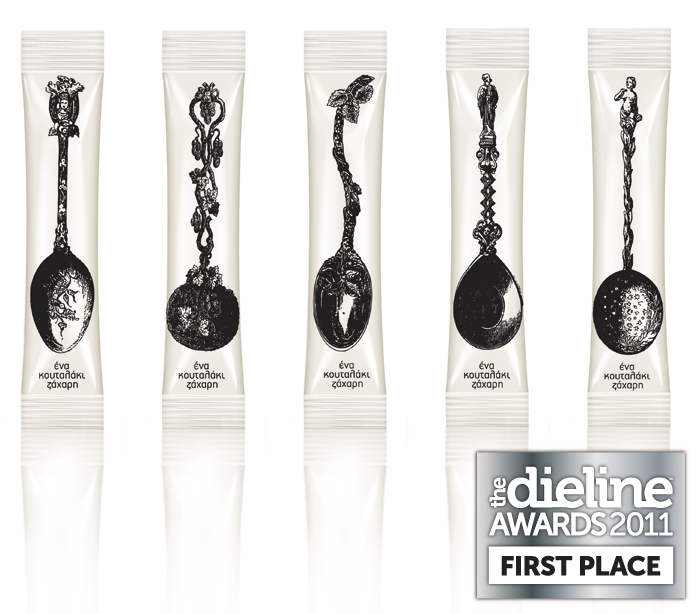
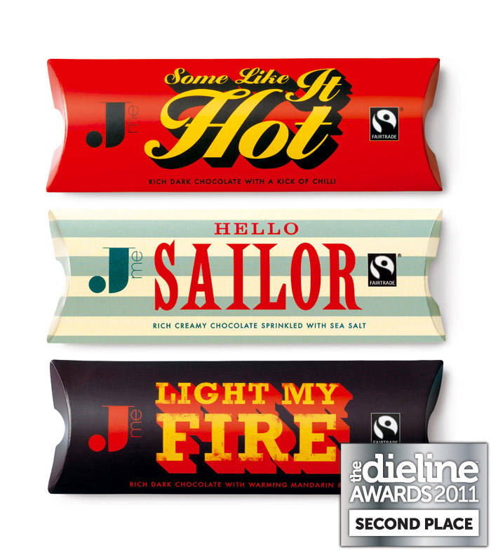
Maud
 Maud is a D&AD award winning design studio based in Sydney, Australia. As passionate about the core idea as the images they create, Maud continually strive for creative excellence through consultation, collaboration and detailed execution, tailoring a strategic process for each and every client they work with to deliver effective and creative communication. http://www.maud.com.au/


 StPete based art director


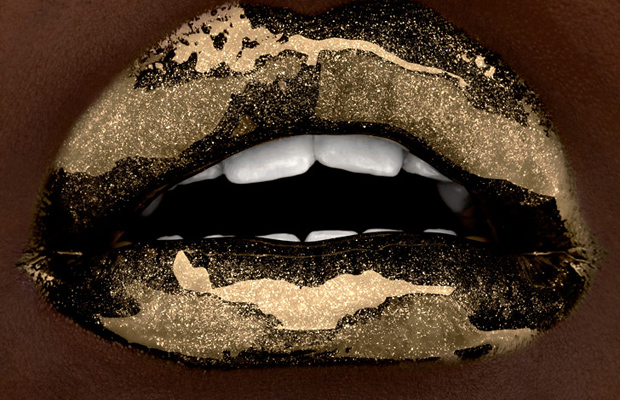
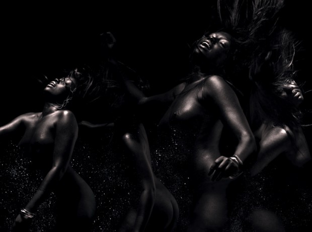

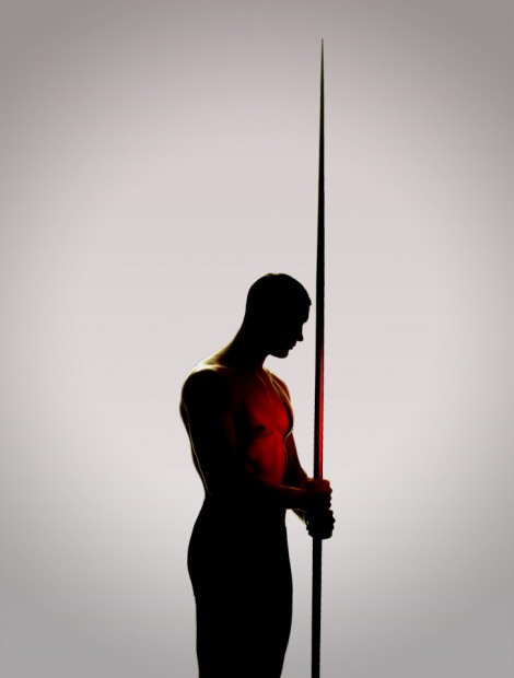
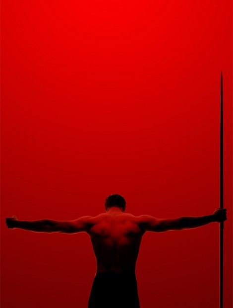
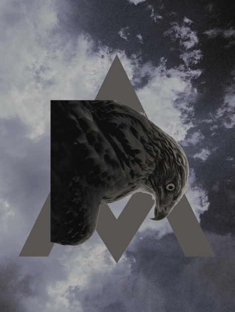
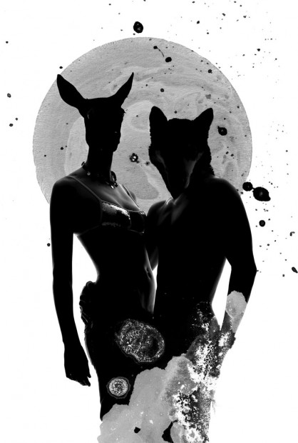
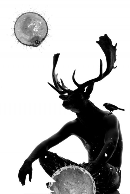
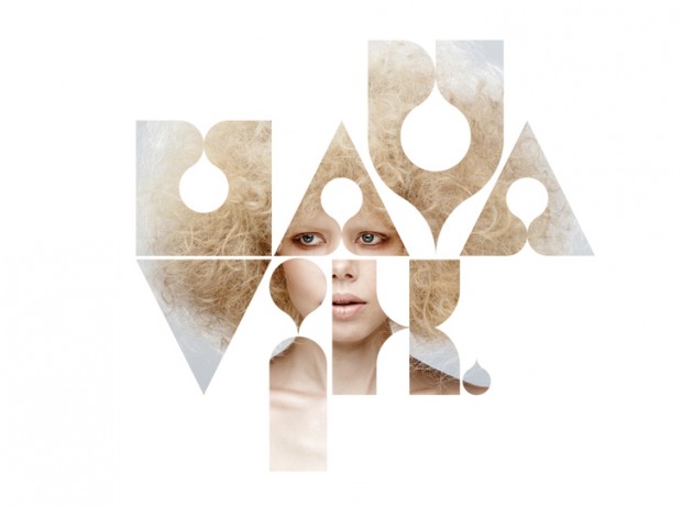

 After winning a competitive pitch, Channel 4 commissioned ManvsMachine to create a new brand identity and on-air look for More4. The package aligns with a re-focussed range of content on the channel.


 Moscow based design studio TOMAT specializes in branding and graphic design. We fave their series of dynamic experimental identity based on four simple fours that creates myriad of brand's graphic presentation.
 We Are Draft™ is the London design studio of freelance designer and art director Chris Smyth. Excellent portfolio of interactive, branding and print projects.


 Toormix is a creative studio specialising in art direction and graphic design established in Barcelona a decade ago. Despite their strong portfolio we invite you to check the logotypes they make for customers, in overall they are awesome still few of them remind us ariston and casa da musica and few other are fun shit. Don't forget to check their portfolio.


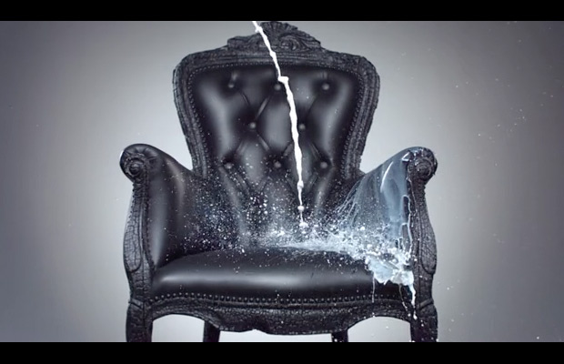 New motion identities for Moscow based Kommersant channel created by Double G for Dixon Baxi.
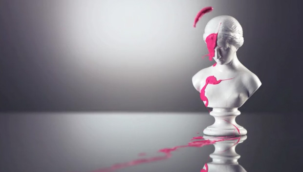


 From Nicole Meyer website:


 Branding and graphic design works from Igor Dubanov are really striking and keep reworked brand attached to the needs of a target audience. That is what we call "cool Russian design".


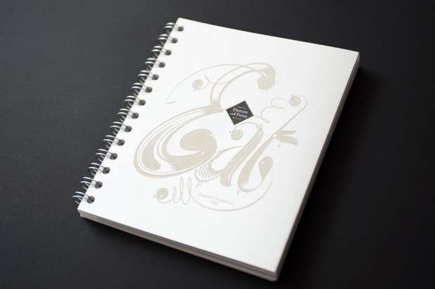
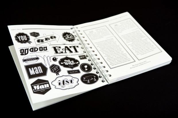
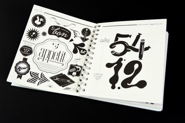
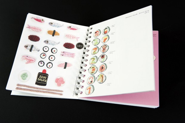
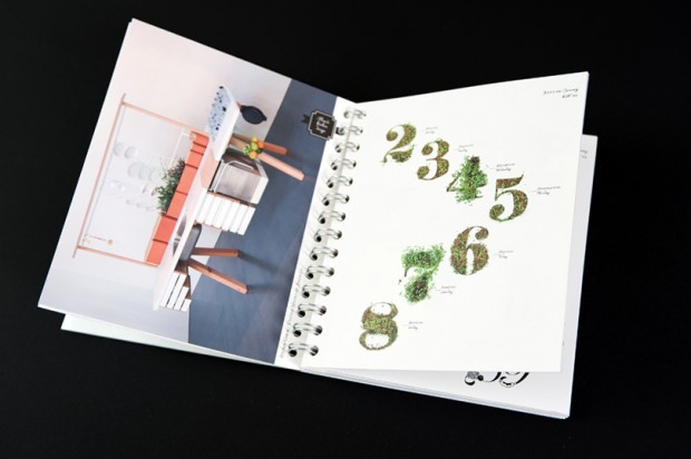
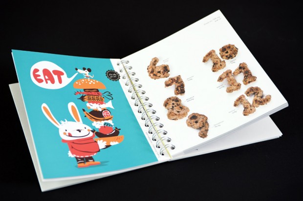
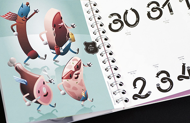
 The “most delicious” design publication of 2012 celebrates design and art for, and from, what is edible. “EAT!” serves week by week inspiration in the form of delicious designs to whet your appetite; with 54 designers, artists and architects illuminating visual trends and special designs from the area of food, drink and nutrition.