David Lynch + Dom Perignon
Advertisement in its pure state. Directed by Luke Gilford
http://vimeo.com/47277993
Advertisement in its pure state. Directed by Luke Gilford
http://vimeo.com/47277993
Atton Conrad O’murchadha is a London based advertising and art photographer. “I love technology, I have used photoshop for over a decade, but there is a certain quality I want to create that is unobtainable by the usual route alone”. Unique results created by unique methodology. Conrad continues to work on commercial team projects, using all forms of lighting, and developing his personal fine art and video projects available on attonconrad.com
"The Leo Burnett Moscow agency has created an interactive print, "Russia. Where the cold is cool!", to show tourists the real and modern Russia, and in turn to raise brand awareness for S7 Airlines in Europe." But there is nothing to do with airlines and a weak stereotypes. The greatest part of this work is Fiodor Sumkin graphics. It is just great and deserve a sight View more details on Fiodor's page
http://www.youtube.com/watch?v=jKjPoXVttBE
"Domo Arigato" as a series takes a look at the paralleled cultural influences of early childhood many of us have experienced and or have seen exhibited today. Classic Japanese cultural icons are infused with luxury branding brilliantly creating an conversation around the identities of the youth today.Mega Man meets Comme, Sonic meets Louis Vuitton, in a iconoclash that's a truly astute observation of today's influences. We are looking forward to seeing how the series is utilized within the real world. We've included an synopsis about the series directly from the artist Mago as well: "Whether Sailor Moon, Son Goku or Pokemon - all these Japanese anime figures were a big part of our childhood. My biggest inspiration for this project was to combine classic Japanese anime characters with luxury brands like Gucci, LV or Chanel to show the brand affinity of the Japanese culture. The series is also strongly influenced by my unique illustration style I've created over the past few years that is characterized by a strong love for details.Take a closer look and discover my passion for anime and luxury brands."
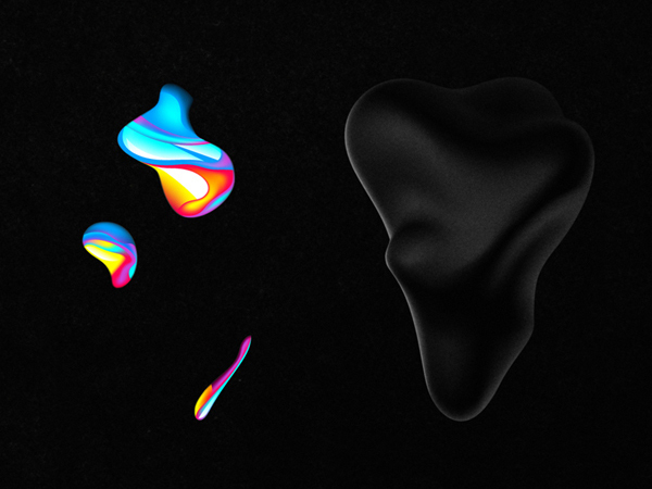
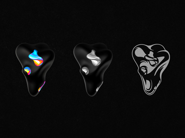
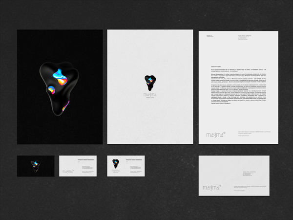
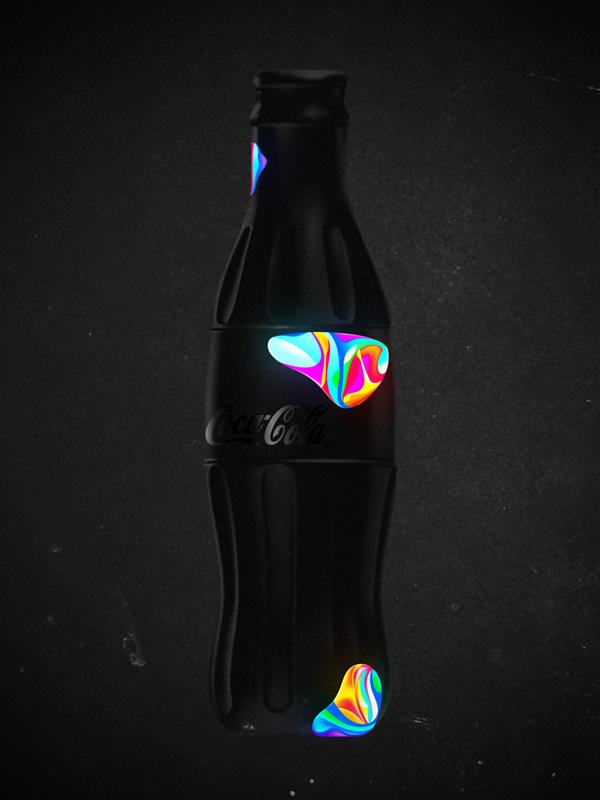
One of the leading Russian digital artist on Behance - Ruslan Khasanov shared an awesome abstract identity made for Magma Creative Group.




The most profound and famous European advertising photographer (fresh up you memories with Sony PSP2 campaign), parisian Dmitri Daniloff caught our attention with personal project "Porcelaine Dolls".

Find more works on his website or Behance profile
If you are not into Olympics this beautifully crafted animated short by Passion Pictures' Pete Candeland will get you in the mood.


http://vimeo.com/46441341
One of the leading media design company The Mill shares their latest showreel


http://vimeo.com/46367404
via Fubiz
London based Bobby "The Slighted" forms "Department International" duo together with Brian Okarski. All of their links contains a heap of very good magazine designs but better we shall take a look on Bobby's covers shared on his Flickr


We spotted Kashiwa Sato flash website five years ago and it is still an example of Japanese way to organize information. This time he is back to shock us with new iPad experience. Check his Portfolio application or watch the video below http://itunes.apple.com/app/kashiwasato.com/id502367977 http://kashiwasato.com/


http://vimeo.com/43805654
We had a chance to speak with Russian designers from "Bureau Working Title" that did a commercial short "A Touching Application" using no 3D software, only projection mapping, modeling and classic animation. The ad shows advantages of Russian navigation application published by Yandex Ltd.

DC: What is the main plot of this advertisiment? The touching story tells us about two sentimental creatures from some outer world; nevertheless, they seem to be a lot like humans. As the two plan their date in a telephone conversation, they decide to meet up in a planetarium. From now on, they get any information from a mobile map application, which tells them the best routes, timing and any other – that's important – interactive tips. They face random barriers on their way: she gets stuck in a traffic jam, he forgets to buy her flowers and so on. The application helps them to finally meet each other on a crossroad and make their way to the planetarium "using" the "street view" option. We see them as they watch the stars leaning towards each other. The story ends up with a slogan: "A touching application".
What was the largest challenge in producing and directing the project? The hardest was to deal with time which passed so slowly. Classic animation process requires a lot of patience, and the more patient you are, the more satisfaction you get when the work is done. But russian advertising is always about tough deadlines, so you have to make it really quick. Thanks to the professionals who helped us getting the shootings done in its best ways and shared their skills with us. Furthermore, it was a great challenge to combine various techniques: stop-motion animation with dummies, iPad-freezelight, 3D projection mapping and a little bit of computer graphics.
How long did it take you to complete the whole project? Making of all the stage requisites, creating the script, directing everything to its sterile fancy looks, shooting till the final cut – the whole process took us about 1,5 months to get done.


http://www.youtube.com/watch?v=CcISIVoSZGQ
Credits:
Concept, script, production: Бюро "Рабочее название" (Bureau Working title) www.workingtitle.ru Director, camera: Ivan Proskuryakov Light: Pavel Ukhanov Animation: Alla Solov'eva Projection mapping: Sergey Titov and Sasha Gavrilova (Stain) Dummies: Igor Khilov Stage requisites: Alexey Petrov, Anastasia Zolotilina, Lena Shagieva Freezelight, compositing, CGI: Marina Cherry, Ira Lubomirova Music: DZA (http://soundcloud.com/dza)
Awesome photo manipulation work of Paris statues photographer by Leo Caillard and digitally dressed by Alexis Persani


http://www.youtube.com/watch?v=52ak299RqHI&feature=player_embedded
Clever identity gets clever prizes. Ermolaev Bureau was among 4 Russian names rewarded by European Design Awards 2012. Designers Vlad Ermolaev and Olga Balina (designer behind our DCMAG logo and cover design) won Gold in Identity for "A-Moloko" project.
This visual identity developed for a company selling milk through a chain of milk vending machines. The logo concept was suggested by the name of the chain: Automated sale of farm fresh milk. The first letter 'A' which when turned upside down resembles a cow's muzzle was taken as the basis. Visual identity is built on a system of symbols that show the path of the milk from the cow to the consumer.
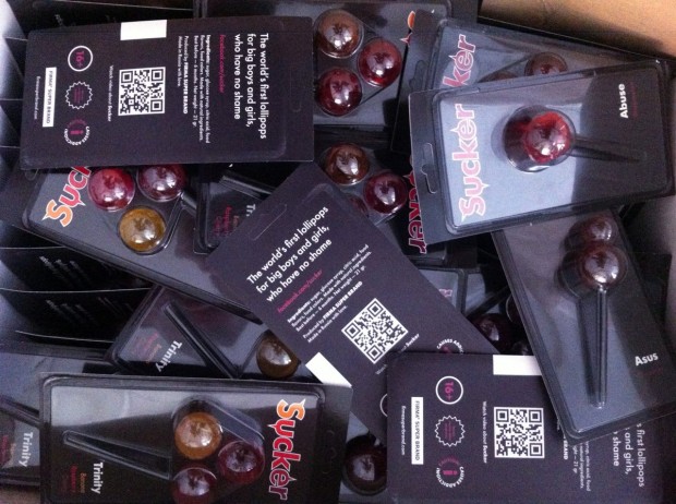
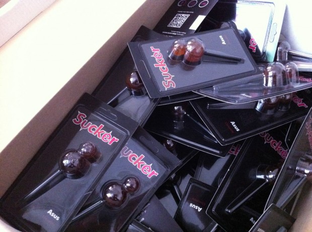
Still controversial culture of the lollipop was fuelled by FIRMASTYLE's Sucker concept in 2008 and now smashed by its production. A series of 5 Suckers is available for every taste and color: Mr. Pain with a taste of blueberry, Abuse with a taste of watermelon, Trinity with a taste of strawberry, cherry and banana, Cherry Twins & Chocolate Asus. A good sense of humour like this can literally save internet from porn invasion.
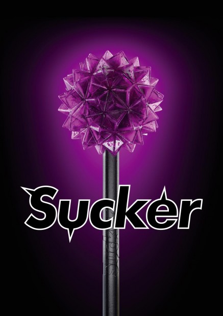
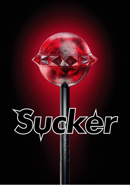
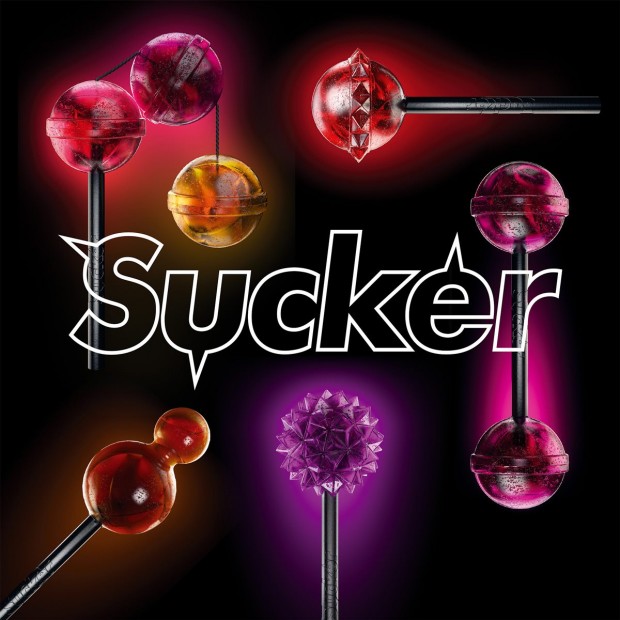
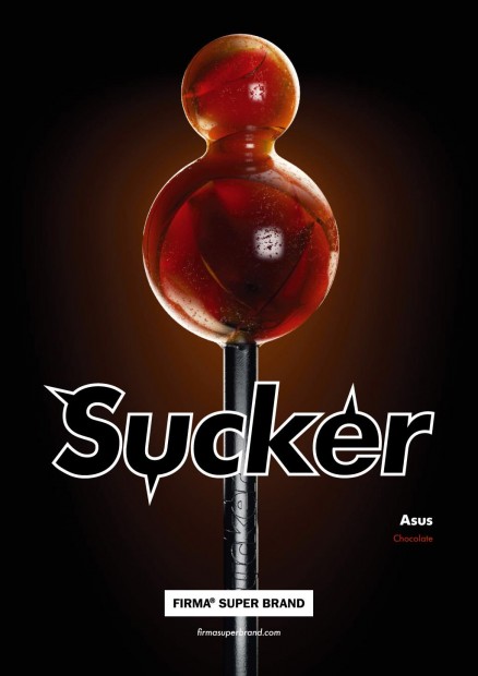
http://vimeo.com/43987241
Surrealism and haute-coutre mixed in a cocktail painted with vivid colours - that's how I see Jean-Francois Lepage photography. Lepage has set himself apart as both a fashion photographer and a visual artist with his innovative approach of merging the two worlds into his own conceptual universe of image making. With the use of drawing and deconstructed collage, Lepage further pushes his work to explore his insights on individuality, mortality, and the unspoken forces which guide the sublime emotional instincts of the human mind.
What can 10 Russian models, one Lamborghini, Dion Agius - The Surfer and a huge artificial electric blue wave do in one short film? They all cast in Joe G's conceptual film mad in the World's best pool for GLOBE TV. Are you still sitting on your chair? Go take day off for the local pool :)
http://vimeo.com/44253174
Jessica Walsh (@jessicawalsh & now @sagmeisterwalsh) is a multidisciplinary designer living and working in NYC. Her work has been featured in numerous magazines and books, and won design awards from the Type Directors Club, Art Directors Club, SPD, Print, Graphis, among others. Recently he joined almighty Stefan Sagmeister as an art director and started working together on "Happy film" expected in 2013. Now they named Sagmeister&Walsh and you might seen that nude photo of them both circulating on design web. Designboom has a nice interview with them, read it out
Here are the works Sagmeister & Walsh did together, for a full Jessica's profile visit http://jessicawalsh.com/ (on Behance)
http://www.youtube.com/watch?v=jUhm_beGBoA