Posters & Logos by Jorgen Grotdal

Poster designs made by Jorgen Grotdal, designer and lettering specialist from Trondheim Norway. Grewing up in a rougher surrounding and handcrafted area, he is inspired by vintage accessories and ideaful simple inverted letterings. Made with pens and chalk his style expands in a set of interesting goods.

jorgen-grotdal-9

jorgen-grotdal-8

jorgen-grotdal-7

jorgen-grotdal-6

jorgen-grotdal-5

jorgen-grotdal-4

jorgen-grotdal-3

jorgen-grotdal-2

jorgen-grotdal-1

Chalk lettering for Channel One Russia

Channel One Russia commissioned lettering master Igor Mustaev to work on winter festive TV splashes that he did on chalkboard. View it on Behance

Channel One Russia team: Art director: Dmitry Likin Photographer: Sergey Kholmanov

igor-mustaev-1

igor-mustaev-2

igor-mustaev-3

igor-mustaev-4

igor-mustaev-5

igor-mustaev-6

http://www.youtube.com/watch?v=vFh-uQkDZAc

Saint Petersburg City Logotypes

Who said it will be easy? To create logotype for the city like Saint Petersburg is like to direct a play of "Lady Macbeth" or "The Master and Margarita". Everybody knows it but nobody got close to it, dead or alive. The city identity requires a lot of everything: starting from a very complicated history ending with citizens that has a lot of doubts and bits about living here. To understand the city as someone said you must "drown" in it, or it will spit you outside or even leave you dying. Literally, Saint Petersburg has a lot of faces, and everyone who gets here see its own face. So let's check the three version of Saint Petersburg City Logotypes.

1. Unknown Pitch

The first one is said to be done by Moscovian (sic 1!) design studio "Art.Lebedev", but it is not approved. Please take this in consideration while studying the logo. First posted on German website (sic 2!), it spread across Russian web with a lot of doubts over iconography and some typography issues.
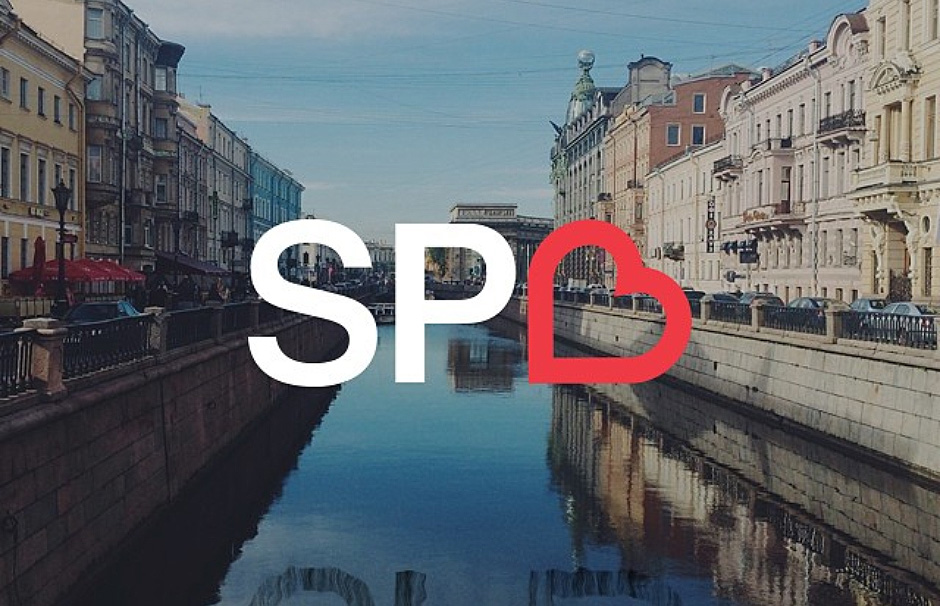
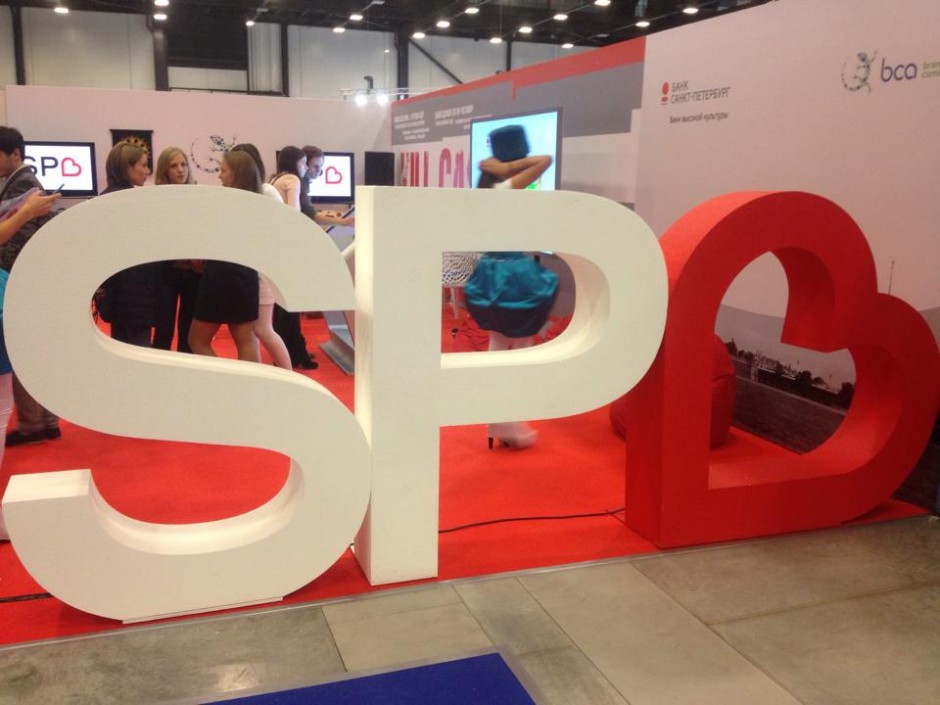
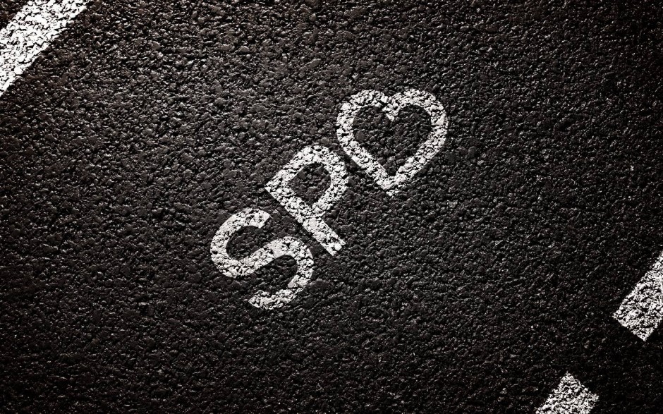
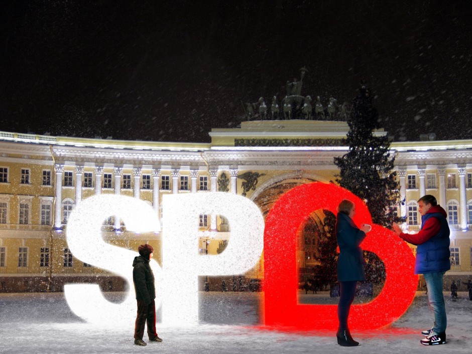
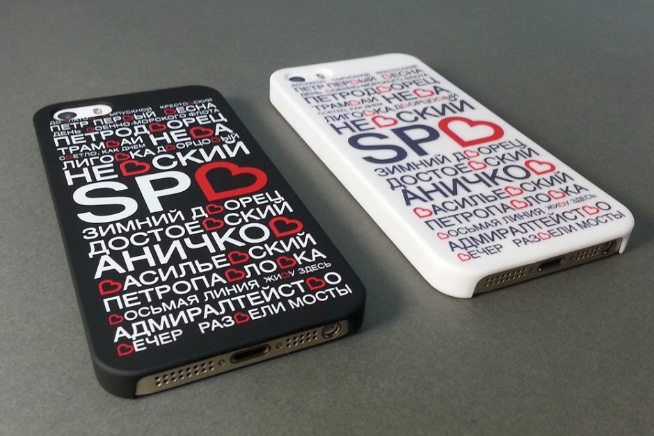
saint-petersburg-city-logo-1

saint-petersburg-city-logo-2

saint-petersburg-city-logo-3

2. I Love SPB

Done by initiative group lead by Ruslan Chernobayev (St.Petersburg Design Week) and talented illustrator Alex Andreyev and supported by BCA Agency, ILOVESPB is a next pitch to have pros and contras. The logo has a personal website http://ilove.spb.ru/ and hope has a long journey to be real.

saint-petersburg-city-logotypes

saint-petersburg-city-logo-4

saint-petersburg-city-logo-7

saint-petersburg-city-logo-6

saint-petersburg-city-logo-5

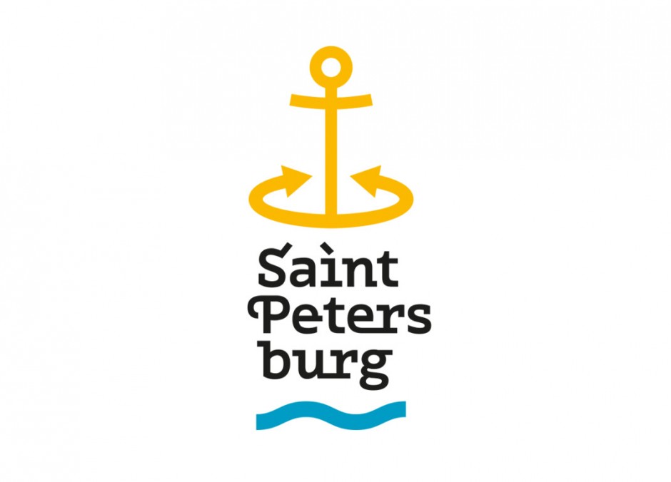
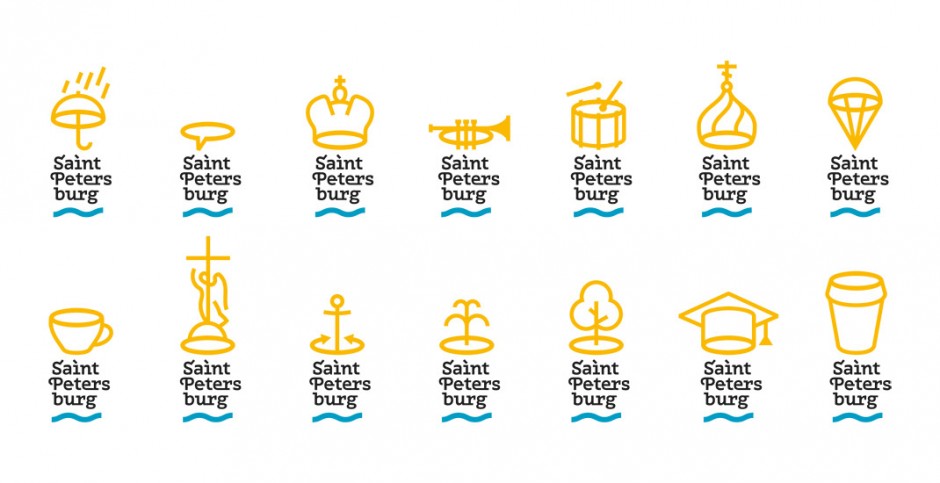
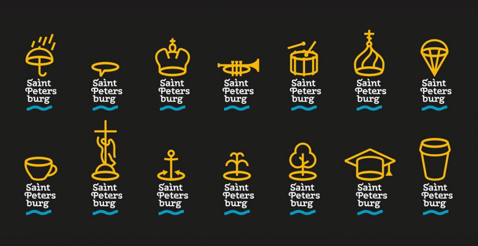
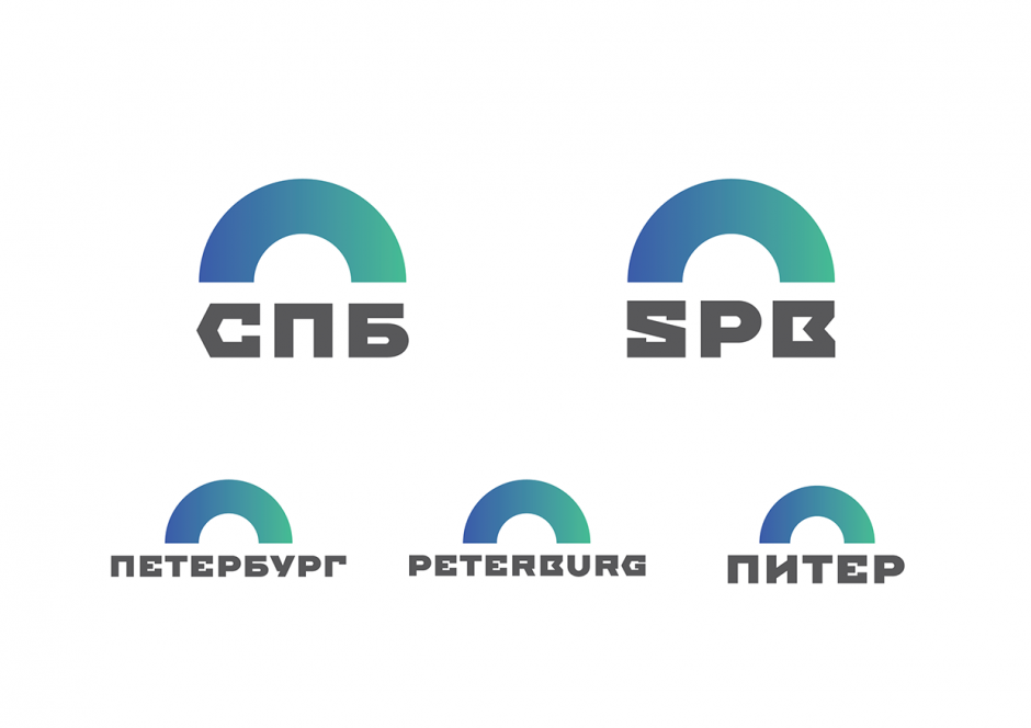
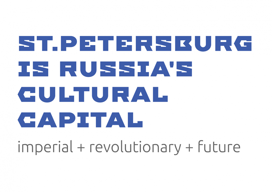
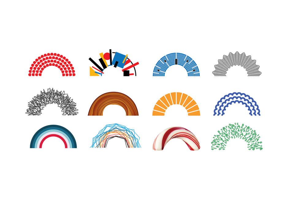
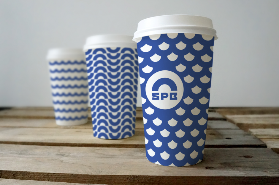
3. Yakushev Design Studio Pitch

The third pitch is again from Moscovian studio of Yakushev Branding has a good typography designed by Ivan Gladkikh and lemon-faced trend of "generic" logotype, that we'll leave on your consideration. Personally, this project is a good moodboard and research of possible graphic design trends, but hardly represents the Saint Petersburg City itself.

saint-petersburg-city-logo-a

saint-petersburg-city-logo-b

saint-petersburg-city-logo-c

saint-petersburg-city-logo-d

saint-petersburg-city-logo-e

Meanwhile please enjoy the beauty of the city in different timelapse motions we collected all this time

Montserrat

"This is a tribute film to the amazing Montserrat typeface, recently designed by Julieta Ulanovsky. A tribute, also, to the Montserrat neighbourhood in Buenos Aires, which inspired the font. An finally a tribute to Jorge Luis Borges. The text is an extract from his wonderful poem Break Of Day (Amanecer) from the book Fervor de Buenos Aires (1923)."

Direction, design, animation: Fernando Lazzari http://www.popscience.tv/ Director of Photography: Matías Nicolás Music: Brian Eno / Black Planet Sound Design: Andrea Damiano Plataforma Buenos Aires, Carolina Tobal

http://vimeo.com/79733436

Norway's New Banknotes

Last week it was revealed that Oslo-based design agency Snøhetta had jointly won a competition to redesign the Norwegian banknote. The Central Bank of Norway announced on October 7 two winner proposals for the design of the new banknotes. Snøhetta’s design will be the foundation for the backsides of the notes, while The Metric System’s design will be the starting point for the fronts.

Backsides by Snøhetta

"When contrasts come together, as when soft meets hard or digital meets analog, a dynamic is created. Our cubical pattern first of all represents pixels; our times visual language."

norway-banknotes-snohetta1

norway-banknotes-snohetta2

norway-banknotes-snohetta3

norway-banknotes-snohetta4

norway-banknotes-snohetta5

norway-banknotes-snohetta6

norway-banknotes-snohetta7

Frontside by The Metric System

norway-banknotes-metricsystem1

norway-banknotes-metricsystem2

norway-banknotes-metricsystem3

norway-banknotes-metricsystem4

norway-banknotes-metricsystem5

Packaging by Yani & Guille

Check the latest awesome packaging and lettering design projects from Buenos Aires based designers Yanina Arabena and Guillermo Vizzari or simply Yani&Guille

«Le Blé» is a deli restaurant, with homemade and French kitchen, offering several locations throughout the city of Buenos Aires, Argentina. We designed a new line of paper bags and packaging, along with a series of illustrations and lettering that accompany the experience of the place.

yaniguille1

yaniguille2

yaniguille3

yaniguille4

yaniguille5

yaniguille6

yaniguille7

yaniguille8

yaniguille9

yaniguille91

yaniguille92

yaniguille93

yaniguille94

Typography Illusions by Nicola Yeoman

Set designer Nicola Yeoman has created a series of artworks, installations and set design for both editorial and advertising campaigns. Some of her projects showcase impressive works of typography—using everyday items such as chairs, scissors, twigs and fabric, she has created letters of the alphabet.

nicola-yeoman5

nicola-yeoman4

nicola-yeoman3

nicola-yeoman2

nicola-yeoman1

nicola-yeoman

The Juice Shop branding

This project is a collaboration between No Entry Design and Josh Held Design. The Juice Shop Kitchen & Juicery is a new juice space that opened up it's first location in New York City's bustling Flat Iron District. Their goal is to provide fresh juices for a more reasonable price than all of the other juice places popping up around the city. More locations will be coming soon.

http://vimeo.com/90781773

juice-shop-9

juice-shop-8

juice-shop-7

juice-shop-6

juice-shop-5

juice-shop-4

juice-shop-3

juice-shop-2

juice-shop-1

Atypical by Pawel Nolbert

Well-known digital artist and graphic designer from Warsaw - Pawel Nolbert presents a series of posters exploring form and rhytm of letters or pseudo-letters presented as half-realistic, half-illustrative figurative sculptures. The artworks were built from an elaborate artistic painterly gestures into expressive arrangements – extending the aesthetic characteristic of typography.

pawel-nolbert-atypical-7

pawel-nolbert-atypical-6

pawel-nolbert-atypical-5

pawel-nolbert-atypical-4

pawel-nolbert-atypical-3

pawel-nolbert-atypical-2

pawel-nolbert-atypical-1

The Brooklyn Bridge in Letterpress by Cameron Moll

Once, I was happy to listen Cameron Moll live during @Media06 conference in London - talented typographer and one of the font web standards pioneer. Later last year he successfully funded a kickstarter project following his hobby of recreating famous architectural locations in type. Thus was about The Brooklyn Bridge, re-imagined as if constructed entirely with type. Upon the beautiful project itself Cameron shares the details on how Kickstarter project went for him. brooklynbridge-cameron-moll-1

brooklynbridge-cameron-moll-2

brooklynbridge-cameron-moll-3

brooklynbridge-cameron-moll-4

brooklynbridge-cameron-moll-5

brooklynbridge-cameron-moll-6

brooklynbridge-cameron-moll-7

brooklynbridge-cameron-moll-8

brooklynbridge-cameron-moll-9

brooklynbridge-cameron-moll-10

http://vimeo.com/76697805

Masha Portnova

Multitalented designer based in St Petersburg - Masha Portnova creates outstanding identities in the best traditions of European graphic schools. Each of her work has a unique visual language based on decomposed grids and flexible typography boundaries. You may check her work on Behance as well as on her website

masha-portnova-11

masha-portnova-10

masha-portnova-9

masha-portnova-8

masha-portnova-7

masha-portnova-6

masha-portnova-5

masha-portnova-4

masha-portnova-3

masha-portnova-2

masha-portnova-1