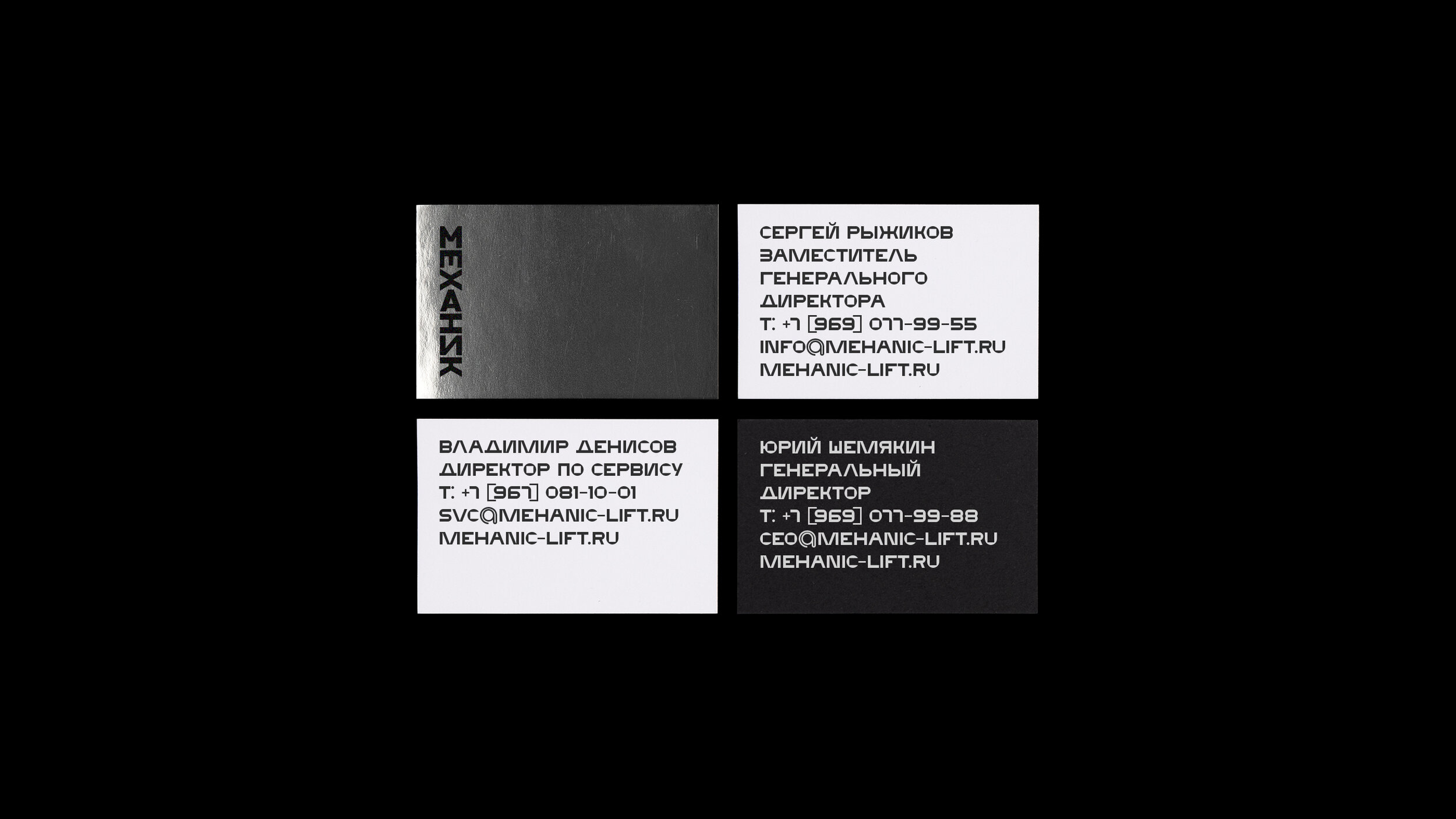
Mechanic Identity
Moscow-based graphic designer Alexander Cherkasov shares his latest project made for “Mechanic” indoor “urban movements” technology company.
“Mechanic” develops three areas of business: elevator equipment, installation and service. The comfort and safety of passengers depend on a quality of provided services.
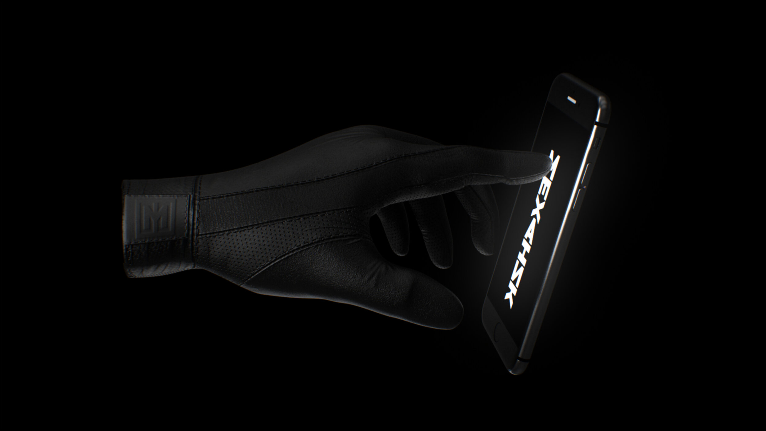
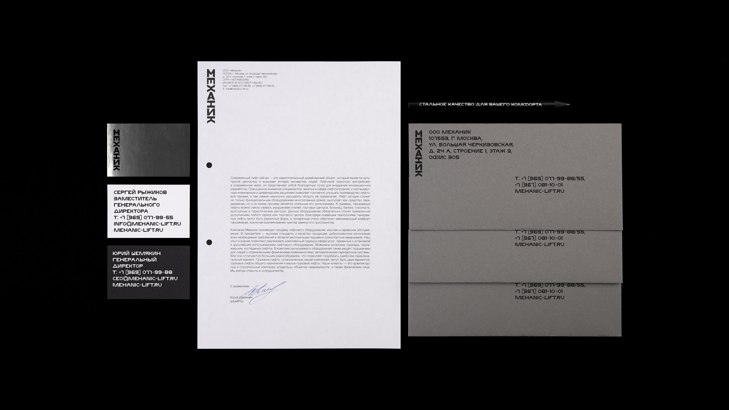
The concept of identity delivers a visual communication as an architecture. For example, a business card can be a cottage, and a website with a lot of pages can be a skyscraper. The human is behind any mechanics from design to operation and it is reflected in a naming and logo. The logo is an elevator that is responsible for “transporting” a lettering.
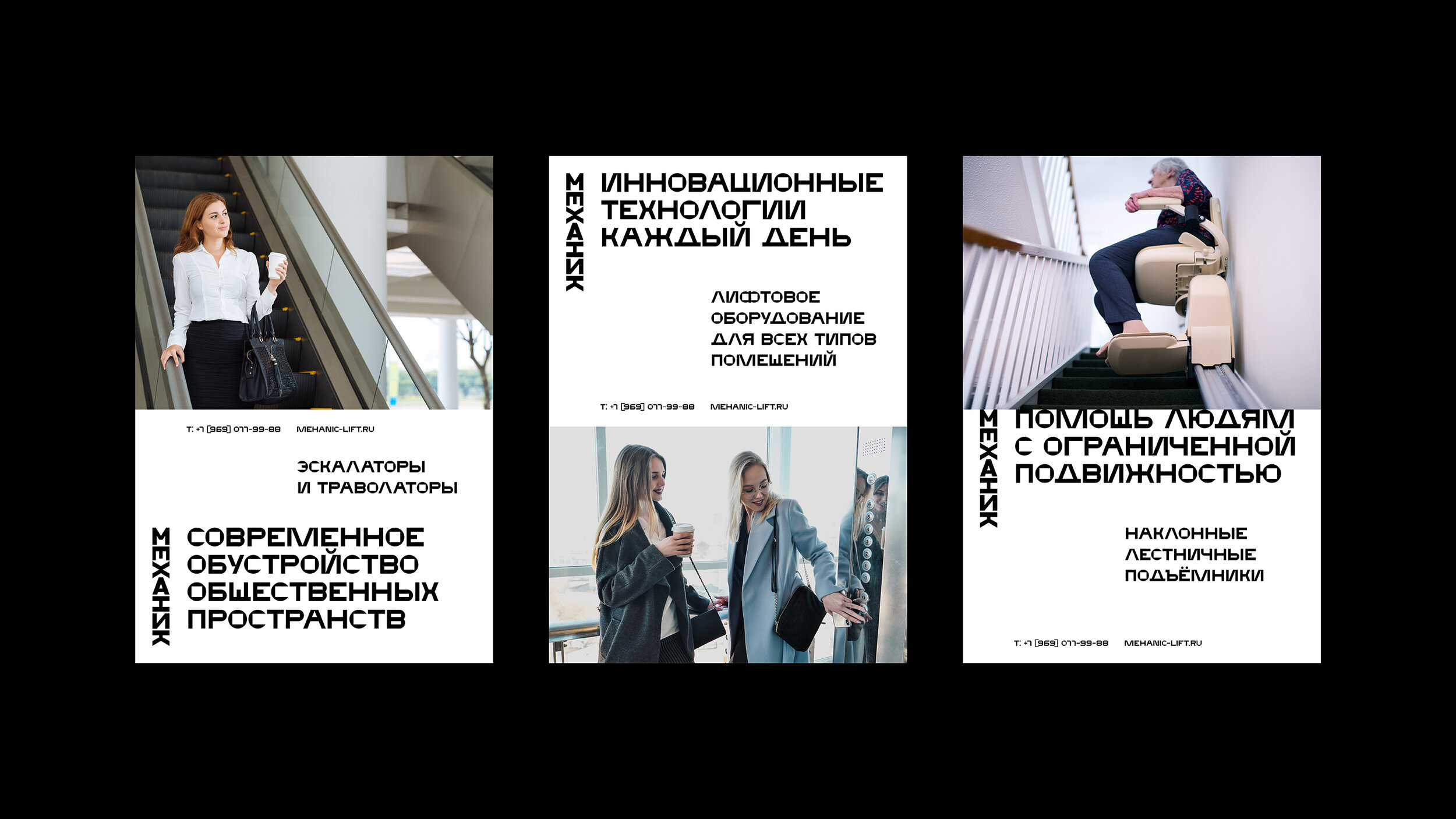
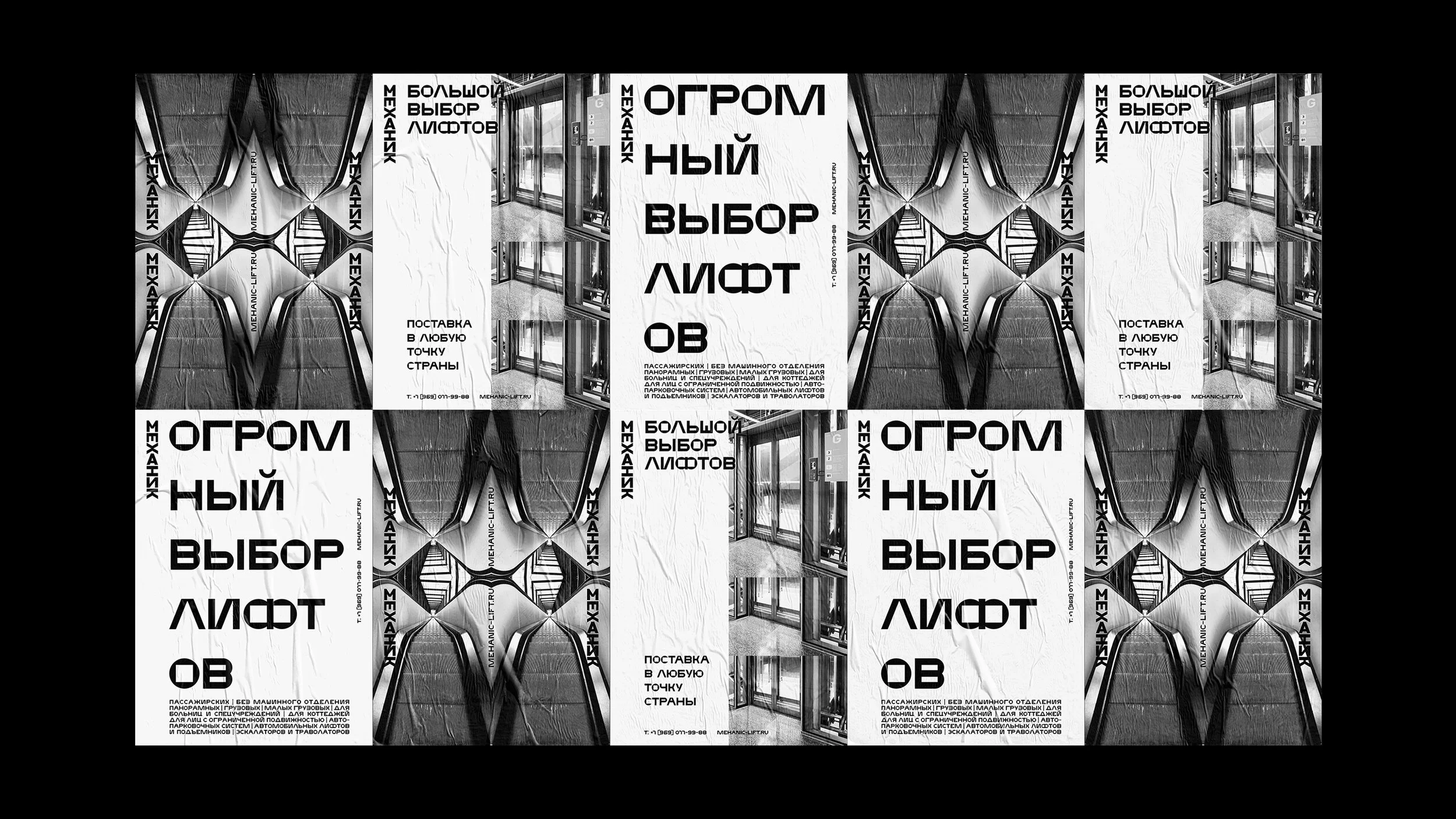
A dynamic identity system adapts any media, which gives an omni-channel opportunity in communication with clients. Monochrome colours support business style. Colour images show the interaction of elevator equipment with people.
Mechanic font is an essential element of brand identity. It embodies reliability, manufacturability, and belonging to mechanics. The font enhances brand recognition and looks good in the case set. In a large size, the letters look like a streamlined mechanism.
This sort of identity is able to solve company's business tasks and look preferable among the competitors. It demonstrates a service sector and at the same time saves austerity and meets the high standard of the company.


