A-Moloko by Ermolaev Bureau
Clever identity gets clever prizes. Ermolaev Bureau was among 4 Russian names rewarded by European Design Awards 2012. Designers Vlad Ermolaev and Olga Balina (designer behind our DCMAG logo and cover design) won Gold in Identity for "A-Moloko" project.
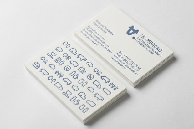
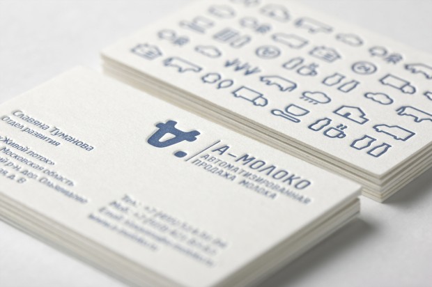
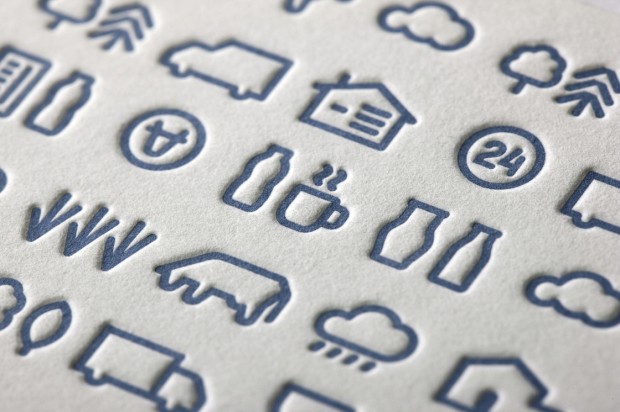
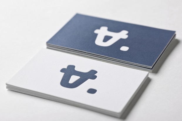
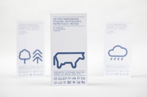
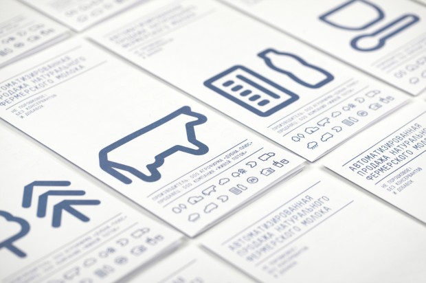
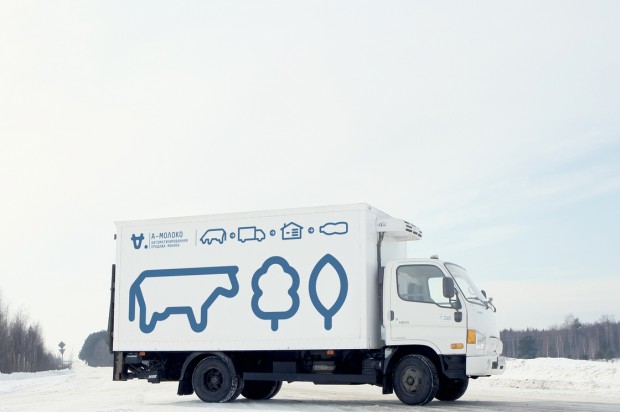
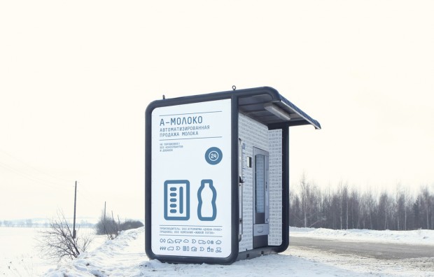
This visual identity developed for a company selling milk through a chain of milk vending machines. The logo concept was suggested by the name of the chain: Automated sale of farm fresh milk. The first letter 'A' which when turned upside down resembles a cow's muzzle was taken as the basis. Visual identity is built on a system of symbols that show the path of the milk from the cow to the consumer.

